How to make a map in Google Fusion Tables
This free data tool isn’t as well known as Google Maps or Spreadsheets, but Fusion Tables provides an easy way to map a data set by regions such as states or counties
Why Fusion Tables and not Maps?
It’s easy enough to map addresses with markers using Google Maps: Enter your address list and you’re done. But what if you want to map data by regions such as states, counties or ZIP codes, with each one color-coded based on a specific data set? That’s where Google’s Fusion Tables comes in. Still listed as “experimental,” this Google Docs feature has nevertheless been used by media outlets and others to quickly create so-called choropleth maps without writing custom code. Here’s how.
Entering data
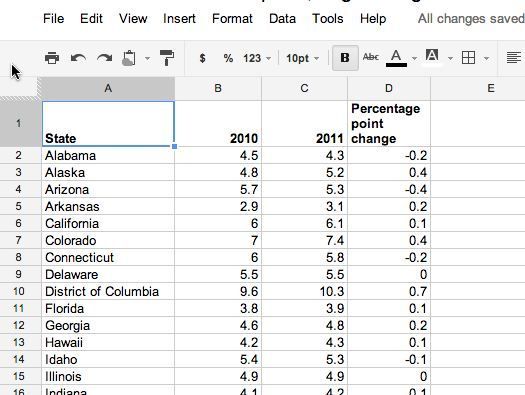
Your first step is to make sure you’ve got data in a Fusion Table-friendly format. That means having column headers in the first row and only the first row — not spanning multiple rows — and data in a single worksheet with contiguous columns and rows. Fusion Tables can accept uploads in Excel, comma-separated and tab-delimited formats, as well as in a Google Docs spreadsheet.
Creating a Fusion Table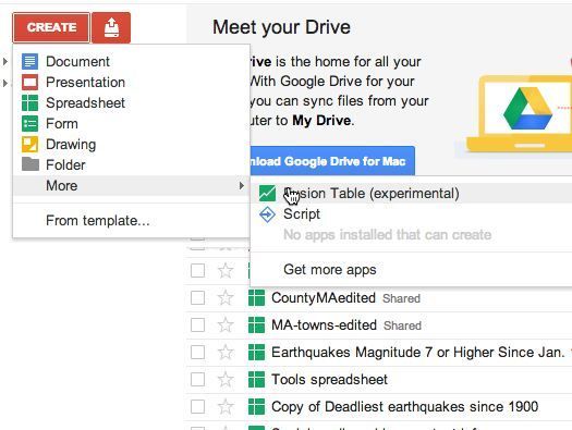
Create a new Fusion Table within a Google Docs account by clicking Create –> More –> Fusion Table (experimental). You’ll then be given the option to upload a file from your computer or copy and convert an existing Google Spreadsheet into a table. You can also create an empty table, but it’s usually quicker and easier to enter data into a spreadsheet and then convert to a table.
Your new table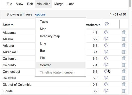
Your new table will look similar to a spreadsheet — but it behaves a bit differently. You can sort by clicking on column headers but can’t use formulas. And you’ve got some interesting options available under the Visualize and Merge menus.
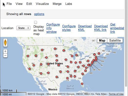
Mapping points
One of the visualization options is a map. Fusion Tables recognizes certain words as places, such as state and country names. However, if you choose to map your data using this single table, you’ll get a map with point markers, not shaded polygons. If point markers work for you, you’re done! If not, you need to find a table with geographic boundary information to upload and merge with your data table.
Adding geographic boundary info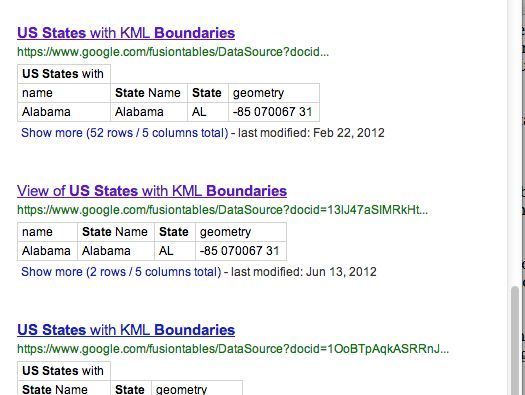
You can search public Fusion Tables for tables that have geographic boundary information (some have only numeric data). Here, I searched for “U.S. states boundaries.” (You may have a problem with searches in Firefox; other browsers work fine.) Some public tables let you view boundaries by choosing Visualize –> Map (others may show only point markers). Save the URL of the table you choose — you’ll need it for merging (next slide).
Or you can use files from government and other sources. The U.S. Census Bureau is one good source. A third-party site, Shape to Fusion, can convert Census TIGER files to KML polygon data for Fusion Tables’ use. You can also upload your own GIS data in KML format.
Joining tables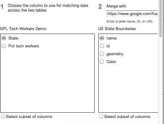
Click Merge to join your geography table with your data table, entering either the name of a table in your account or the URL of your own or a public table. You’ll need to find a common column in each of them — just like you’d join tables in a relational database. Here, I’m joining the data table with a publicly available state geography table, using the column “State” in the data table and “name” in the geography table (each contains the same list of state names).
Color-coding polygons on your map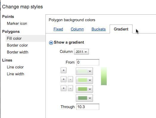
Select Visualize –> Map now and you’ll still get a map with points on it. To change this, click on “Configure styles” and then choose “Fill color” under “Polygons.”
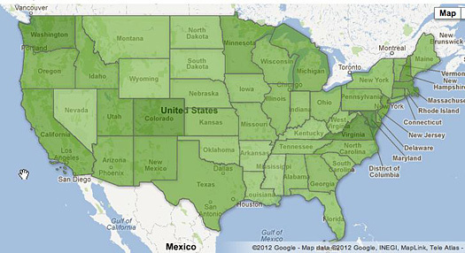
You can then choose either Gradient or Buckets. Gradient allows you to select one color and the number of slices of your data — here, the data is divided into four groups, and Fusion Tables colors the map from light (lower) to dark (higher) green. Buckets gives you more options in the range of each group and use of multiple colors.
If you’ve got more than one data column, you’ll need to select the one you want to visualize.
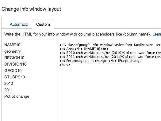
Customize the info window
You can also customize what appears when a user clicks on a colored portion of your map by selecting “Configure info window” and choosing the Custom tab.
Embed and share your map
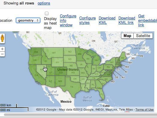
The final product looks like this. To embed the map in a Web page, click the share button at top right (not shown) and make it viewable by the public, then click on “Get embeddable link.” You can also share a link to your map to view on Google.
More resources
For more on Fusion Tables, see this 9-minute tutorial by Google engineer Kathryn Hurley. For more about mapping and other tools, see Computerworld’s interactive chart of 30+ free tools for data visualization and analysis and our review of 22 free tools for data visualization and analysis.
Best Microsoft MCTS Certification, Microsoft MCITP Training at certkingdom.com

